
### Pantone’s Color of the Year: A Five-Year Evolution in Design
Pantone’s **Color of the Year** is a global trendsetter, influencing fashion, branding, and interior aesthetics. Each year, the Pantone Color Institute selects a shade that reflects cultural shifts and emotional resonance. Let’s explore the last five years of color trends.
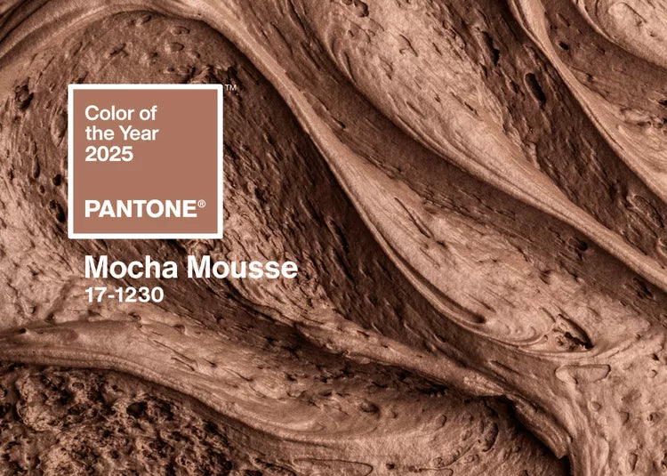
1. **2025 – Mocha Mousse**: A rich, earthy brown that exudes warmth and stability, perfect for grounding designs.

https://www.abisilks.com/products/coffee-brown-dark-brown-soft-silk-saree-1
2. **2024 – Peach Fuzz**: A soft, inviting hue that promotes comfort and connection, widely embraced in fashion and wellness branding.

https://www.abisilks.com/products/french-rose-golden-yellow-soft-silk-saree?_pos=1&_sid=ce8626f52&_ss=r
3. **2023 – Viva Magenta**: A bold, electrifying red that symbolizes strength and optimism, making a statement in digital and print media.

https://www.abisilks.com/products/magenta-soft-silk-saree-1?_pos=1&_sid=5d7b338a1&_ss=r
4. **2022 – Very Peri**: A dynamic periwinkle blue infused with violet undertones, representing creativity and transformation in tech and design.

https://www.abisilks.com/products/light-purple-peacock-green-soft-silk-saree?_pos=1&_sid=286a36a75&_ss=r
5. **2021 – Ultimate Gray & Illuminating**: A dual selection—gray for resilience and yellow for hope—capturing the essence of perseverance and positivity.
These colors reflect societal moods, offering inspiration across industries. Whether designing a brand identity or revamping interiors, Pantone’s selections provide a roadmap for creative expression.
Leave a comment
This site is protected by hCaptcha and the hCaptcha Privacy Policy and Terms of Service apply.